ayywi:面向 AI 智能体的设计系统,内置 linter 防止智能体跑偏
danitesler/ayywi
ayywi 是一个"AI-first"设计系统,为 AI 智能体提供设计 token、无障碍组件与响应式产品外壳的严格契约,并配有 linter 在智能体偏离时纠错。
The AI-first design system. Say it "AY-wee": AI + UI, squashed into one word.
When you ask an AI tool to build UI, you usually get five mismatched shades of grey, broken mobile layouts, and missing empty states. ayywi is written for the agent as much as for you: a strict contract of design tokens, accessible components, and responsive product shells, plus a linter that catches the agent when it strays.
Status: early (0.0.x). The API can still change between releases. Pin a version.
- Small: zero runtime dependencies, ~24 kB of CSS gzipped for all 65 components.
- Built for AI tools: one prompt or one MCP connection gives your agent the full contract, component specs, and real-time linter.
- States and accessibility built in: components ship empty, loading, and error states; interactive ones have focus rings, keyboard support, ARIA, RTL, and Windows High Contrast styles. axe runs on every component page and showcase app (no serious or critical violations), and
pnpm checktests every text colour against every surface in every theme. - Themes & density: four themes (
dark,light,dark-contrast,light-gray) and three densities (compact,comfortable,touch), driven by single attributes. - Responsive by contract: apps automatically switch from a desktop sidebar to a mobile top bar and bottom nav; websites fold into a phone menu without custom media queries.
Who it's for
Anyone who builds UI by asking an AI tool. You describe the product, your agent builds it with ayywi, and the linter sends it back when it drifts. You don't need to be a designer or a front-end developer, and if you are one, the tokens, themes and brand engine are yours to shape.
| AI tools usually… | ayywi gives them… |
|---|---|
| invent colours and spacing | Tokens only. The linter flags raw colours (hex, rgb(), named) and made-up ayy- classes. |
| skip empty, loading and error states | A rule plus a component for each: Skeleton, Empty state, Alert with retry. |
| break on phones | Shells that switch to phone layouts by themselves: sidebar → top bar and bottom nav, navbar → menu. |
| hand-build controls that fail with a keyboard or screen reader | Native-first components with focus rings, ARIA, RTL and High Contrast. |
| drift from screen to screen | One contract, read through llms.txt or MCP, and a reviewer agent that checks finished screens. |
Start building in one prompt
You don't need manual npm installs or complex framework configurations. Your AI agent sets up and builds everything from a single prompt.
1. Web app builders (Lovable, Bolt, v0, Replit)
Paste this into your chat when starting an app:
Style this project with the ayywi design system. Link these in <head>:
<script src="https://cdn.jsdelivr.net/npm/@danitesler/ayywi@0.0.2/dist/theme-init.js" integrity="sha384-lGmWLHV63f2b1zy44y+untQnyYqkUy+4KcwBm+sfcXKIO/kWbNNpS4+F1cX4uGfz" crossorigin="anonymous"></script>
<link rel="stylesheet" href="https://cdn.jsdelivr.net/npm/@danitesler/ayywi@0.0.2/dist/fonts.css" integrity="sha384-xlJC6P/OPjbl1PpLS8nyeR5McBXBvlbILZYs3NqxQ7FfDQXHvg7heYTa98Xsh1av" crossorigin="anonymous">
<link rel="stylesheet" href="https://cdn.jsdelivr.net/npm/@danitesler/ayywi@0.0.2/dist/ayywi.min.css" integrity="sha384-altFI0nfvLSSoGPhVT70AVPSf95VMLF+yG6Xlae/gnfkwrCAetcXPS5u4vhp5ozx" crossorigin="anonymous">
<script src="https://cdn.jsdelivr.net/npm/@danitesler/ayywi@0.0.2/dist/elements.global.js" integrity="sha384-xK75X2mKGtliwi6gHAqBfZXRM664py5XCf1fUULjWKLpOr3s8CcalLjP/ZqvydXA" crossorigin="anonymous" defer></script>

Rules:
- Use only ayywi classes (ayy-*) and tokens (--ayy-*). Read https://cdn.jsdelivr.net/npm/@danitesler/ayywi@0.0.2/llms-full.txt for the component contract, responsive rules, and copy-ready patterns.
- If the project already uses Tailwind, use it for layout only, never its colour scale (bg-gray-900, text-blue-500). Don't add shadcn/ui or another UI kit.
- An app uses .ayy-app-shell (sidebar on wide screens, top bar + bottom nav on phones).
- Every list and table must include a loading state (.ayy-skeleton), an empty state (.ayy-empty-state), and an error state (.ayy-alert--destructive with retry).
- No hardcoded colours. Dark and light themes follow data-theme on <html>.
The links are pinned to one release with SRI hashes, so a later release can't restyle a shipped app and a tampered file won't load. To upgrade, change the version and the hashes together.
2. Coding agents (Cursor, Claude Code, Windsurf)
Connect ayywi's Model Context Protocol (MCP) server so your agent can inspect components, search tokens, and lint its own UI:
{
  "mcpServers": {
    "ayywi": {
      "command": "npx",
      "args": ["-y", "@danitesler/ayywi", "mcp"]
    }
  }
}
Or ask your agent to initialize ayywi in an existing codebase:
npx @danitesler/ayywi init
This sets up the agent skill, Cursor rules, AGENTS.md guide, and MCP server automatically, plus two things that keep agents on the components:
- A lint hook (Claude Code): after every UI file the agent writes,
ayywi lintruns on it and hands the findings back, so a raw<select>, a clickable<div>or a hand-built card gets fixed before the agent moves on. - A reviewer agent (
ayywi-ui-reviewer): checks a finished screen piece by piece against the "need → component" map and lists every place an ayywi component was skipped.
The MCP server's pick_component tool answers "what do I use for this?" ("choose a theme" → Select or Segmented control, never a raw <select>).
3. Interactive prompt generator
Visit the live Get Started page in the preview:
- Pick your product type (Dashboard, Booking, Store, Support Inbox, Settings, Landing Page).
- Customize who it's for and what it needs.
- Select your target AI tool (Lovable, Bolt, v0, Cursor, Claude Code, Replit, ChatGPT) to get a tailored prompt.
- Copy one-click refinement prompts for mobile polish, dark mode, button consistency, and missing states.
Product shells & responsive layouts
ayywi eliminates custom responsive CSS by providing built-in layout contracts:
- Web Apps (
App shell): On wide screens, renders a desktop sidebar with a collapsible icon rail. On phones, automatically transforms into a top brand bar and bottom tab navigation. - Websites (
Navbar): Full horizontal navigation on desktop; automatically collapses into an accessible mobile menu button on screens below 48rem. - Settings: Notion- and Claude-style settings in a near-full-screen modal — sections beside the open one on desktop, full screen with drill-down navigation on phones.
Brand in one colour
ayywi is monochrome until you brand it. Give it one seed colour and a corner preference.
npx @danitesler/ayywi brand "#0ea5e9" --name acme --shape softThe brand engine automatically:
- Generates an 11-step colour scale (
--ayy-brand-50…--ayy-brand-950). - Picks the primary button fill nearest your seed that reaches 3:1 against every surface, and a label colour that reaches 4.5:1 on that fill, in every theme. It prints each check, and skips any step that would fail.
- Sets focus ring tokens and corner radiuses (
pill,round,soft,sharp).
AI agents can also generate brands on the fly using the MCP tool create_brand.
Themes and density
Apply themes and density modes with single HTML attributes on <html> or any container:
<html data-theme="dark-contrast" data-density="comfortable">
| Theme | Appearance |
|---|---|
| (none) | Follows the user's operating system (dark or light) |
dark / light |
The default clean dark and light palettes |
dark-contrast |
Pure OLED black page with high-contrast cards |
light-gray |
Clean white cards on a grey canvas |
Densities include compact (desktop default), comfortable (looser spacing), and touch (automatically activated on mobile devices for 44px+ tap targets).
Components
| Category | Components |
|---|---|
| Actions | Button, Toolbar, Dropdown menu, Command palette, Floating action button, Theme toggle |
| Navigation | Navbar, App shell, Bottom nav, Top bar, Footer, Breadcrumb, Pagination, Steps, Contents |
| Forms | Field, Input, Input group, Search bar, Textarea, Select, Combobox, Tag input, Calendar (and date picker), Checkbox, Radio, Segmented control, Chip, Swatch, Choice card, Slider, Number field, File upload, Switch, Shortcut (keys and recorder), Settings |
| Layout | Page header, Section, Card, Tabs, Accordion, Carousel, Separator |
| Overlays | Dialog (centred, side modal or bottom sheet), Popover, Tooltip |
| Feedback | Alert, Toast, Progress, Progress ring, Spinner, Skeleton, Empty state |
| Data display | Badge, Kbd, Avatar, Icon, Icon tile, Stat, List, Data list, Swipe actions, Frame, Chat, Table, Chart |
Layout utilities (.ayy-stack, .ayy-cluster, .ayy-spread, .ayy-grid, .ayy-split) and a marketing site kit (containers, hero type, scroll reveal) handle the structure between components.
Explore live
Visit the interactive preview:
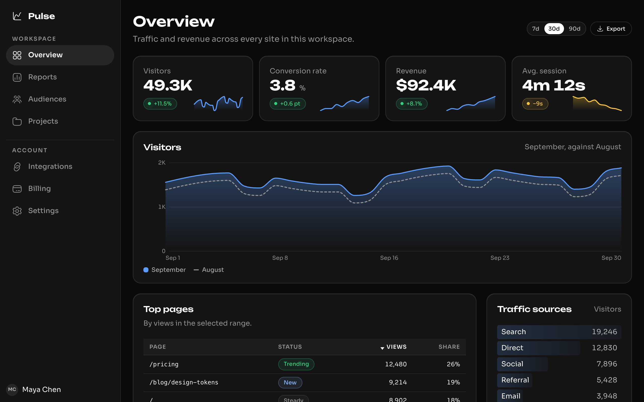
- 7 full-scale showcase apps: Dashboard, Marketing site, Support inbox, Settings, Habit tracker, Store, Booking app (viewable at desktop, tablet, and mobile sizes).
- Component browser: Every component with live interactive stages, theme toggles, and copy-ready HTML and React code.
- Brand playground: Test your brand colour and corner radius in real time.
Working on ayywi
Instructions for contributors and agents modifying ayywi itself are in AGENTS.md. Changes are tracked in CHANGELOG.md.
pnpm build && pnpm typecheck && pnpm check && pnpm test
scripts/check-all.sh
License
MIT
来源:GitHub · github.com